
Typography
Approved Font Families and Weights
Typography is a key component of SWOSU’s brand identity. Consistent use of our approved fonts ensures legibility, accessibility, and a distinct visual voice across all communications.
Headlines
- Viral – Primary headline typeface. Bold and energetic, used for titles, section headers, and large display text.
- Weights: Regular, Bold (preferred).
- Example:

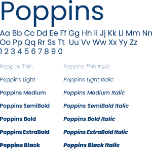
Body Copy
- Poppins – Clean, modern sans serif for body text, subheads, and captions.
- Weights: Regular, Light, Semi-Bold for emphasis.
- Chosen for readability in both digital and print contexts.
- Example:
Script (Accent Use Only)
- Haydon Brush – Licensed script font used sparingly for accent applications (e.g., limited headings, campaigns, or spirit-driven graphics). Not broadly distributed due to licensing restrictions.
- Never use in an all-caps scenario.
- Example:

Color Application
- Typography should follow the official SWOSU brand palette: Bulldog Blue (PMS 541 C), Bulldog Gray (Pantone Cool Gray 6), White, Pantone Process Black, and approved accent colors.
- Always maintain high contrast between text and background to ensure ADA/WCAG 2.1 AA compliance.
Usage Hierarchy
To create consistency, SWOSU typography follows a clear hierarchy for print and digital materials. The following guidelines set order, size, and style rules for different text levels.
Headings
- Primary Headings (H1) – Used for titles, covers, and major section headers.
- Typeface: Viral Bold
- Size: 36–60 pt (print), 32–48 px (digital)
- Tracking: Slightly tightened (-10 to -20) for display impact
- Line spacing: 110% of type size
- Secondary Headings (H2) – Used for subsections and feature headers.
- Typeface: Viral Regular or Bold
- Size: 24–36 pt (print), 20–32 px (digital)
- Line spacing: 115% of type size
- Tertiary Headings (H3/H4) – Used for smaller subheads and callouts.
- Typeface: Poppins Semi-Bold
- Size: 14–20 pt (print), 14–18 px (digital)
- Line spacing: 120%
Body Copy
- Typeface: Poppins Regular
- Size: 10–12 pt (print), 14–16 px (digital/web)
- Line spacing: 135–150% of type size for readability
- Accessibility: Maintain contrast ratio of at least 4.5:1 for normal text and 3:1 for large text.
- Alignment: Left-aligned, ragged right (avoid justified text to reduce rivers and gaps).
Special Applications
Pull Quotes
- Typeface: Viral Bold or Poppins Semi-Bold
- Size: 18–24 pt (print), 20–28 px (digital)
- May be in Bulldog Blue or accent color for emphasis.
Captions
- Typeface: Poppins Regular or Light
- Size: 8–9 pt (print), 12–14 px (digital)
- Typically Process Black or Bulldog Gray.
Callouts/Infographics
- Typeface: Poppins Bold for labels and data
- Size: Minimum 12 pt for print, 14 px for digital
- Always use brand colors for charts, icons, and infographic text.
Accessibility Considerations
All typography used in Southwestern Oklahoma State University (SWOSU) communications must comply with ADA Title II requirements and WCAG 2.1 Level AA standards. Clear, legible typography ensures equal access for all audiences, including individuals using assistive technologies.
Minimum Sizes
- Digital: Body text should be no smaller than 16 px (≈12 pt).
- Print: Body text should be no smaller than 10–12 pt, depending on the typeface.
- Headings: Use progressively larger sizes (18–24 pt and above for digital; 14 pt and above for print) to establish hierarchy.
- Interactive Elements: Buttons, form labels, and navigation text must be at least 16 px for readability and usability.
Font Weight & Contrast
- Weights: Use regular to bold (400–700). Avoid ultra-light or thin typefaces, which reduce clarity.
- Contrast Ratios:
- Body text: minimum 4.5:1 contrast against background.
- Large text (18 pt+ or 14 pt bold): minimum 3:1 contrast.
- Backgrounds: Do not place text over images or patterns unless a solid overlay is added to preserve legibility.
Accessibility Checklist for Typography
- Minimum size: 16 px digital / 10 pt print
- Maintain required contrast ratios (4.5:1 body, 3:1 large)
- Avoid thin or ultra-light fonts
- Use sufficient line height and spacing for readability